Shirt Stains: Hockey Jerseys
You better believe you’re droppin’ the gloves.
Hockey playoffs are now in full-swing, and I am psyched. My New York Rangers are currently facing the Pittsburgh Penguins, and it’s been a competitive series so far. Hockey is the best sport, and I’m not just saying that because I played it for about 20 years. Is there any professional sport better? Baseball? Nah. Basketball? Come on. Lacrosse or Rugby? Bro. Soccer? This is America, pal. Golf and tennis? Get out. No, seriously, get out. The only sport that comes close is football. Football players don’t need to learn how to move on a sheet of ice on thin blades. Also, there’s no out-of-bounds in hockey to run to safety. Yup, hockey is pretty great. Leave it to metal bands to try to ruin it with bad hockey jersey merchandise. Oh, and hilariously bad tribute songs.
Misfits – Some Kinda Skate

Did you know that this is a Misfits product? I know, it’s hard to tell, what with the lack of Misfits logos, the Crimson Ghost symbols, and the Misfits font. If this were any more Misfits, it would come pre-soaked with Jerry Only’s taint sweat. Initially, I thought that the “Famous” printed on this jersey/long-sleeved shirt hyrbrid was a reference to the band’s album Famous Monsters and someone just forgot the “Monsters” part. The Misfits actually have a partnership with the clothing company Famous. Y’know, that company with the giant, slanty bubble F that people that like motocross and skateboarding wear.
The partnership may seem a little odd on the surface, but Famous was created by Travis Barker, the drummer most famous for playing in The Aquabats. It also explains why a band from New Jersey would have a hockey jersey based off of the 1990’s Wayne Gretzky-era Los Angeles Kings. The New Jersey Devils have been terrible for the past few years, so that’s probably a good call. Sadly, they didn’t use the wonderfully 70’s purple-and-yellow Kings jersey design.
All that being said, there’s no real explanation for why this jersey-shirt is so hideous. Does the Misfits name need to be on both sleeves? Do they think they’re a death metal band or something? Does “Famous” need to be on the front twice? I do like that the Crimson Ghost is wearing a little crown. That’s adorable. I can only imagine that the back is just a picture of Jerry Only and Travis Barker sitting on a pile of money while former LA King Marty McSorley assaults someone with his stick.
Slipknot – 2 Minutes For Sucking


If you’re 555, then this hockey jersey is shit, shit, shit. Is that blobby banana slug an official Slipknot symbol? It’s actually a double-sided goat/abomination that kinda sorta looks like an “S”. Why not use the standard back-of-your-notebook S symbol instead? That’s the more recognizable symbol anyway. The goat slug looks like a big glob of snot that you haven’t wiped off yet. They love that nautical symbol behind it so much that they decided to print it all over the shoulders for some reason. It makes it look like the floral print on your grandmother’s table cloth.
The back of the jersey has “Negative 1” on the name plate. That’s… that’s not a name. That’s a statement. That’s a strange song title choice to use as a name. How about using one of the band member’s names? Maybe because they didn’t want a warehouse full of unsold “Crahan” hockey jerseys. Wouldn’t “-1” be better as the number for the jersey instead of XIX? Do they even teach roman numerals in school anymore? Will Slipknot fans see this and think it says “Zix”? The whole thing I think is zix.
Metal Blade Records – Hot stuff coming through!


Clothing promoting record labels seems a little odd. On the one hand, you want to support something you like and help promote it. On the other, you’re probably not going to like everything the label puts out forever. Shirts and hoodies are one thing, but a hockey jersey is a little specific. I’m sure there are some people reading this that would kill for the chance to wear a Profound Lore football jersey or an Iron Bonehead tube top. Metal Blade head Brian Slagel is a huge hockey fan, going so far as to join the ownership team for a minor-league team. It makes sense that Slagel would want Metal Blade to have hockey jerseys. It doesn’t make sense that the jersey would look like the outfit of a creepy guy doing Smashmouth at karaoke.
Fire can work on a hockey jersey as seen by the Calgary Flames and their kick-ass pre-game 3D video sequence. It’s important not to overdo it. This jersey treats flames like the piss of a drunken frat boy. “Fuck it, it has a mind of it’s own and just goes everywhere! Hope my parents don’t use the boat house any time soon! I love you, bro!” Flames on the sleeves, flames on the front going in a weird direction. It’s a flame orgy and your sex-life isn’t invited! The only thing missing from this female-repellent is dice-shaped buttons. One skull? Nah, let’s have two skulls! While we’re at it, let’s use a real shiny material for the jersey that no pro team actually uses. Gotta be comfortable when you’re belting out a rendition of “All Star” to a crowd of uncomfortable onlookers.
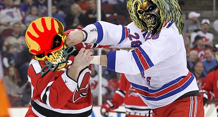
Iron Maiden – The Tripper


In fairness to Iron Maiden, this is not an official piece of merchandise. If Bruce Dickinson ever saw this hockey jersey, he may just stay up in his plane forever, refusing to touch down on the planet that spawned this bad acid trip. My guess is that this jersey was created for an adult league full of guys that like cheap beer, bratwurst, and NFC North teams. I appreciate their love of Iron Maiden and wanting to incorporate the band’s artwork into their team. The hockey stick used to hold up the Union Jack? Creative! Making the debris Eddie is standing on look like an ungodly pile of shit? Well, I guess that’s creative too, though probably not their intention.
Did they need to include the grim reaper? That seems like a bad omen for a sport with blades, sticks, and pucks that can go over 100 miles per hour. As if all that isn’t enough, the sleeves have services stripes and Iron Maiden’s A Matter Of Life And Death logo? That album came out in 2006. The Trooper appeared on Piece of Mind which came out in 1983. Now you’re just screwing things up. I’m not positive, but are those 666’s on the shoulders? Now we’re going back to 1982. Sigh. I guess we should be happy they didn’t use the art from Dance Of Death. Yeeeeesh.
Five Finger Death Punch –5 minute major for Getcha Pulling


Ahhhhhhhhhhhhh! Kill it! Kill it with fire, guns, knives, cars, trucks, buses, tanks, plane malfunctions, bombs, lasers, drowning, blunt force trauma, acid, hypothermia, electrocution, food poisoning, dysentery, choking, syphilis, auto-erotic asphyxiation mishap, really bad heartburn, toxic shock, allergic reaction, and watching every Tyler Perry movie in one sitting!
There’s so much going on with this hockey jersey, and it’s all terrible. This jersey could be used in the Scared Straight program. It’s like a mashup of of worst parts of NASCAR, bicycling, and regrettable tattoos. This jersey is what you get when you consume your 10,000th Monster Energy drink. It’s disturbingly appropriate that the sleeve says “DP” because no matter how you look at it, you’re in for an unpleasant and uncomfortable ride.


