Shirt Stains: D Is For Death Metal, C Is For Crappy Shirts

It also stands for “Cookie” and that’s good enough for me.
Death. Destruction. Chaos. Violence. War. Defilement. These are all hallmarks of death metal. If you can think of something sick and depraved, there’s probably a death metal song about it. We can go from general acts of carnage to incredibly specific descriptions of bodily fluids and functions. The only thing more disgusting than the songs are these shirts.
Amon Amarth – With Brodin On Our Side
Praise Odin and pass the mango habanero boneless wings! Loki will never be able to use his mischievous tricks on you because he’ll be too busy giving you a wedgie. You’ll look so good rolling coal across the Bifrost with this thing on.
This shirt has everything a mall metal dork could want: giant Thor’s hammer, rune symbols, flames. All that’s missing is a can of Surge and this shirt can come free with a purchase of the latest World of Warcraft download. There’s so much going on that the band’s name is an after-thought.
“Guys, we really have to get that Celtic knot-looking thing on the arm? Are we missing anything?”
“More flames?”
“Yes! Good call! Anything else?”
“More Viking stuff?”
“Ok…good…um…anything else? Something that really screams “Amon Amarth?”
“Hmmmm…maybe our name?”
“Crap. Yeah, probably should squeeze that in somewhere. But don’t cover the sweet Thor’s hammer!”
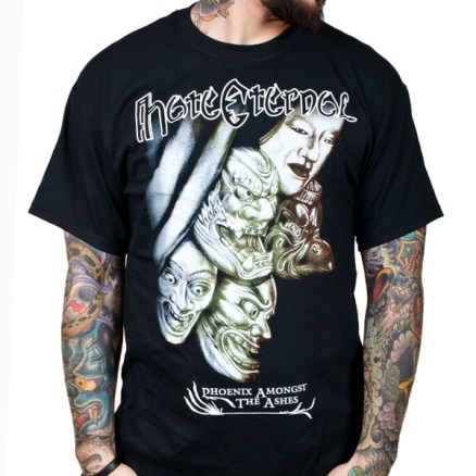
Hate Eternal – Kabuki Theater 3000
I haven’t listened to Hate Eternal all that much. What I’ve heard has been decent. My first introduction to them was people hating them, then liking them, and then indifference. Could be worse I suppose. Since I don’t know much about them, I have to ask, “Are they from Japan?” A quick search of google would reveal that they are, in fact, from Florida. That makes the shirt all the more confusing (not to mention culturally inappropriate). But hey, maybe that’s what the album is about, you tell me.
Either way, those are some goofy looking faces. They could look good if they didn’t look like a sketch book found in a bathroom stall at a Starbucks. I guess I shouldn’t be surprised looking at the artwork for this album. What’s going on in the top corner of the shirt? Are those swords? Aluminum siding? Wolverine’s claws? The bland off-white and brown coloring is all the more apparent when the models tattoos are all bright and colorful. Plus, he has a better face on his arm than the faces on his chest.
Honestly, the biggest reason this shirt is on the list is because of the face on the left. The one with the huge smile and the bulging eyes. Check out where he’s looking. Yup, right at the crotch. He is so incredibly excited to see your junk that he might plotz. That’s either an incredible Easter Egg or a disgruntled artist having a laugh.
Morbid Angel – Crapel of Ghouls
Who…Why…How…But…If…When…Oh boy. This shirt is ugly. It’s hideous in stereo. It’s terrible in Technicolor. In Indiana Jones and the Raiders of the Lost Ark, when the Nazis opened the ark, this shirt was inside. When Rose from Titanic dropped her jewel in the ocean, it was because it looked like this shirt. When the dinosaurs in Jurassic Park escaped, they were trying to get away from this shirt.
What exactly is supposed be going on? Is that skeleton with the flowing hair being impaled on the gate? Is it coming through the gate? It looks like the world’s worst game of checkers. When someone says “king me” you just puke into their eyes. It’s like a tic-tac-toe board for the criminally insane. I’m not exactly sure what’s happening on this shirt, but the Castlevania theme plays in my head every time I look at it. Quick, throw some holy water!
Morgoth – No thanks. I’ve had enough goth.
Ever wanted to know what happens to a Christmas ham by the time April rolls around? Morgoth knows and they want you to wear it. It’s got that rotten pink and green hue to it you only see in spoiled food and FOX News guest commentators. You can actually smell the rotting pig anus on this shirt. The design isn’t the worst, but it’s somewhere between ultra detailed and not detailed enough. Maybe that’s from age, but who knows. It’s like a thumb with a tongue.
The other problem with the shirt is the font for the words. Just doesn’t work for me. Some of you may like it, but to me, it looks like a bunch of lines. Morgoth (or Morgath as an old Century Media compilation I have labeled them) would have been better off with something more simple. A little less brutal and a little more legible. Hmmm, now that I think about it, what’s the name of this band again? If only they thought to include it somewhere on the shirt.
Obituary – End Is Complete…I guess
On last week’s Shirt Stains, ToH reader CT-12 commented how Obituary managed to not be included. It takes the artwork for The End Complete and mashes it up with one of those ugly Fail Bro button down shirts. You know the ones I’m talking about. Those silky bright blue shirts with giant orange flames and dice-shaped buttons. Nothing says brutal like the unofficial uniform of the perpetually virginal.
This shirt pisses with the seat down and misses on purpose. This shirt kicks your chair in the movie theater. This shirt trains in MMA just to hurt people. This shirt chews with it’s mouth open. This shirt asks you what happens in new TV episodes. This shirt owns one of these stupid St. Patrick’s day hats. This shirt is planning to go to Mayhem Fest and leave before King Diamond. This shirt has a library card just to rent free DVDs.
I hope you’re happy, CT-12.


